Color Schemes & Swatches
Adam uses a powerful color scheme system that lets you define multiple color palettes and apply them to different sections throughout your store.
1. Understanding color schemes
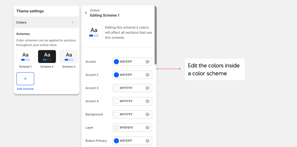
A color scheme is a set of colors that work together — backgrounds, text, buttons, borders, and accents. Adam supports multiple color schemes, so you can use different palettes for different sections of your store. See how to create and edit color schemes in Theme Settings.
Each color scheme includes:
| Color | Description |
|---|---|
| Primary | Main accent color for highlights and links. |
| Secondary | Secondary accent color. |
| Tertiary | Third accent color for variety. |
| Background | Primary text color. |
| Text | Aspect ratio of images: 3:4, 1:1, Custom. |
| Text 2 | Secondary/lighter text color. |
| Button text | Text color on primary buttons. |
| Button background | Background color of primary buttons. |
| Button text inverse | Text color on secondary buttons. |
| Button background inverse | Background color of secondary buttons. |
| Layer 1 | Background for cards and elevated elements. |
| Layer 2 | Background for nested/deeper elements. |
| Overlay | Overlay color for images and modals. |
| Border | Default border color. |
| Error | Error state color (e.g., form validation). |
| Warning | Warning state color. |
| Success | Success state color. |
| Status 1, 2, 3 | Additional status/badge colors. |
2. Product variant swatches
Adam supports visual swatches for product variant options (especially colors).
Setting up color swatches
-
Go to
Theme settings>Swatchesto configure the swatch appearance: Theme Settings- Swatch size: Small, medium, or large.
- Swatch shape: Circle or square.
- Border: Show/hide border on swatches.
- Hover effect: Enlarge, highlight, or shadow on hover.
-
Go to
Theme settings>Variant pickersto configure how variant options are displayed:- Style: Dropdown, buttons, or pills.
- Enable swatches: Turn on visual swatches for color options.
- Show selected value: Display the selected option name.
-
How swatches work
- Shopify automatically generates color swatches based on your variant option names. For example, a variant option named "Red" will display a red swatch. You can also use custom swatch images by uploading files to your store's files with specific naming conventions.