THEME SETTINGS
Overview
Use Theme settings to customize the store's typography, colors, cart, social media, and more.
The Theme settings menu provides controls for adjusting the Adam theme's settings. For example, you can use the color schemes to adjust the color groups used in the theme.
Adjust a theme setting
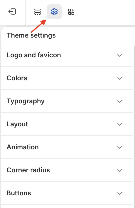
To adjust a theme setting, follow the following steps.
-
On the store’s admin page, select Online store from the side menu.
-
In the Current theme area, select Customize.
-
From the customize theme menu, select Theme settings. Depending on the size of your device’s screen, the menu is on the left or right side.
-
From the Theme settings menu, select a menu section.
-
In the expanded menu section, select a setting to adjust.
-
Adjust the settings.
When you’re finished adjusting the theme, to avoid losing unsaved changes, select Save at the top of the Theme settings menu.
Theme Adam's settings
Select a setting described in the following table
| Setting name | Description |
|---|---|
| Logo and favicon | Adjust the theme's logo and favicon. |
| Colors | Adjust the theme's color schemes. |
| Typography | Adjust the theme typography system (heading, paragraph): font family, font size, font weight, line height, letter spacing, scale, case. |
| Layout | Adjust the page layout: width, Spacing between sections, Container gap, Grid gap. |
| Animation | Adjust the show-up animation of elements when scrolling after the page loads: Desktop smooth scroll, Animate duration, Animate effect, Animate strength. |
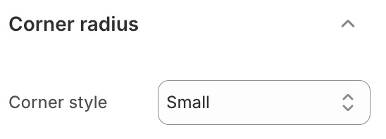
| Corner radius | Adjust the corner radius of elements: None, Small, Medium, Large. |
| Buttons | Adjust the buttons: Button presets, Variant, Button loader, Font, Text weight, Text case, Corner radius. |
| Input fields | Adjust the inputs in forms: Input presets, Corner radius, Border. |
| Badges | Adjust the sale badge in product cards and product detail: Preset, Content type. |
| Products cards | Adjust the style of product cards: Product media hover effect, Maximum swatches to show, Variant images, Quick view aspect ratio media. |
| Cart | Adjust the mini cart: Cart type, Drawer position, Show note, Show discount, Show free shipping, Show product suggestion. |
| Modal | Adjust the modal popup: Color scheme, Padding, Margin, Animation, Backdrop. |
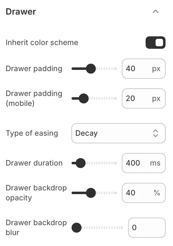
| Drawer | Adjust the drawer: Color scheme, Padding, Margin, Border. |
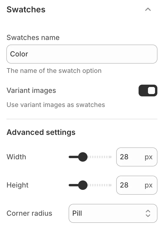
| Swatches | Adjust the product variant swatches: Swatches name, Variant images, Width, Height, Corner radius |
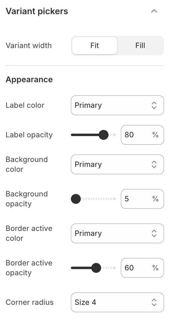
| Variant pickers | Adjust the variant pickers: Variant width, Corner radius. |
| Image lazyload | Adjust the image lazyload: Enable lazyload, Type of loading. |
| Currency format | Adjust the currency: Show currency codes. |
| Dark mode | Adjust the dark mode color scheme: Dark mode mapping. |
| Social media | Adjust the social media links: Social links. |
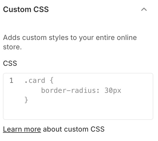
| Custom CSS | Adds custom styles to your entire online store: Custom CSS. |
| Theme style | Change theme style: preset-1, preset-2, etc. |
1. Logo & Favicon
Use the Theme settings > Favicon menu options to customize your store’s logo & favicon.
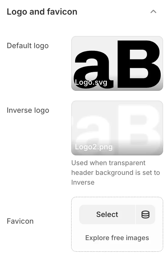
- Default logo: Select the main logo image for your store.
- Inverse logo: Select a logo variant used when the header background is transparent (e.g., light logo for dark backgrounds).
- Favicon: Select an image to use as your store's favicon. The maximum image size for a favicon is 32px x 32px. Uploaded favicon images that exceed these dimensions will be scaled down.
2. Colors
Use this settings to set how colors are used throughout your store.
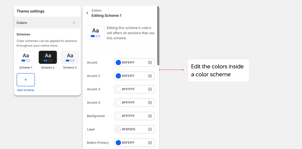
You can use the available color schemes, or edit them or create new schemes. Color schemes can be applied to sections throughout the online store.
- Primary, Secondary, Tertiary: Accent colors used for highlights, links, and decorative elements.
- Background: The main background color (supports gradients).
- Text & Text 2: Primary and secondary text colors.
- Button text & Button background: Styling for primary buttons.
- Button text inverse & Button background inverse: Styling for secondary/outline buttons.
- Layer 1 & Layer 2: Background colors for layered elements like cards and panels.
- Overlay: Color for overlays on images and modals.
- Border: Default border color.
- Error, Warning, Success: Status indicator colors.
- Status 1, Status 2, Status 3: Additional status colors for badges and labels.
3. Typography
Use this setting to set how text is displayed throughout your store. You can select the font families for subheadings, headings body texts, and anywhere else with typeface.
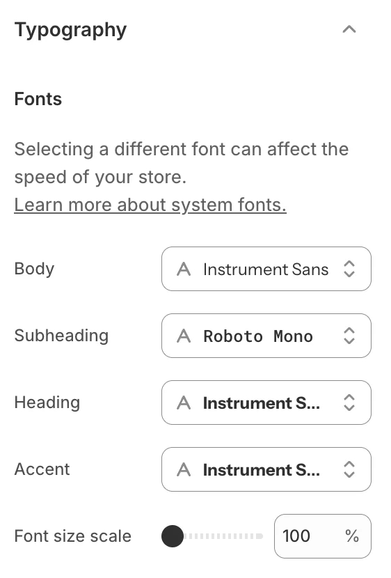
- Body font: Select the font family for body text.
- Heading font: Select the font family for headings (H1-H6).
- Sub-heading font: Select the font family for sub-headings.
- Accent font: Select the font family for accent/decorative text.
- Font scale: Adjust the overall font size scale (100%-130%).
Keep in mind that using the System fonts is preferable since they load faster than other font.
4. Layout
Use this settings to change the theme page's layout - from the width to space between sections, and grid.
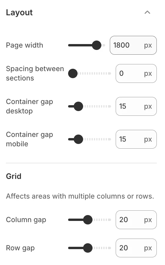
- Page width: Choose between preset width options or set a custom container width.
- Section spacing: Control the vertical spacing between sections.
5. Animation
Use this settings to change the duration of the animation and the effect.
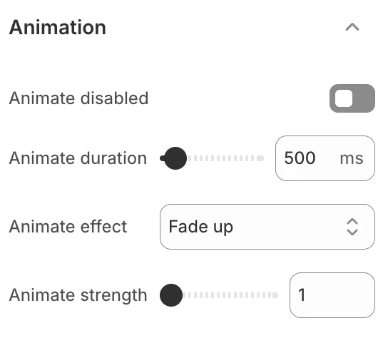
- Animation duration: Set how long animations take to complete.
- Animation effect: Choose from fade, fade-up, slide, zoom, rotate, and more.
6. Corner radius
Use this setting to control the border radius of elements throughout your store.
7. Buttons
Use this settings to change the style of the button.
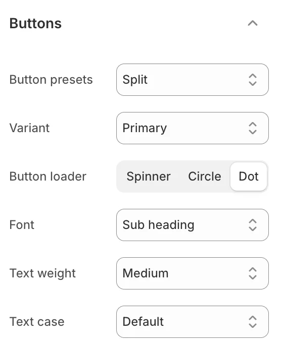
Configure button styles including padding, font weight, text transform, border width, and hover effects for both primary and secondary button variants.
8. Input fields
Use this settings to change the style of the input.
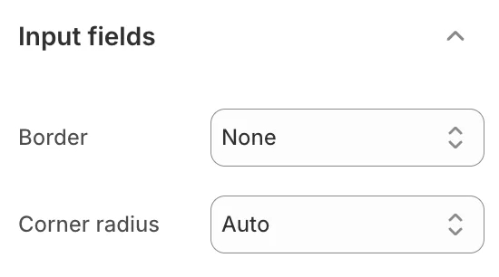
Control input field styling including border style, padding, background, and focus states.
9. Badges
Use this setting to customize the appearance of badges throughout the theme.
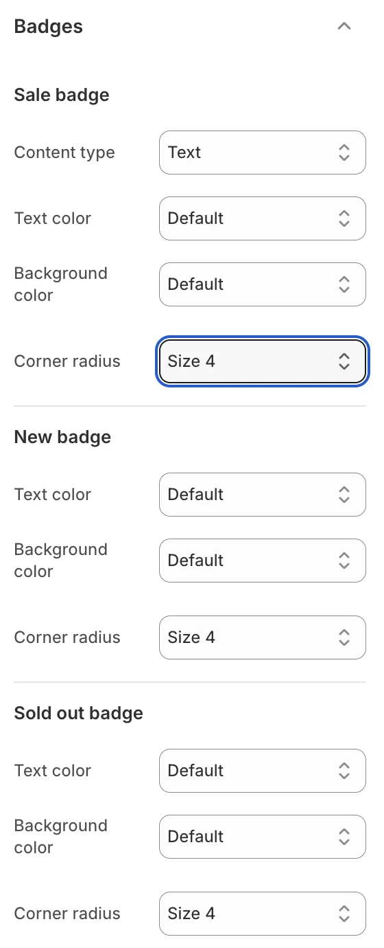
Configure badge styles for sale badges, product status badges, and custom badges including text color, background, border radius, and positioning.
10. Products cards
Use this settings to change the look of the product cards for products.
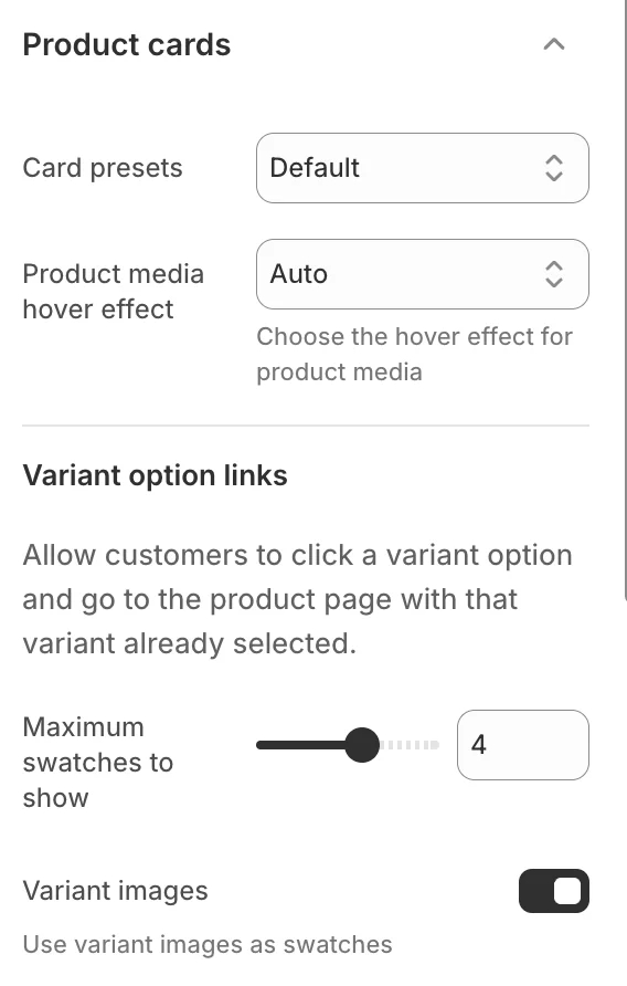
Configure how product cards display across the store, including image ratio, hover effects, and information shown on cards.
11. Cart
Use the Theme settings > Cart menu options to set how customers purchase products on your store’s cart page.
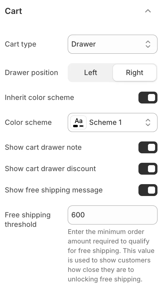
- Cart type: Set the cart to display as a Drawer or Page when the Add to cart button is selected.
- Show vendor: Show/hide the names of product vendors on the cart page.
- Cart drawer placement: Choose to show the cart drawer on the left or right of the screen.
- Show cart free shipping: Show the free shipping bar and set the threshold amount.
12. Modal
Use this settings to change the look of the modal with border, shadow and the animation.
For example, change how the Quick Preview modal looks.
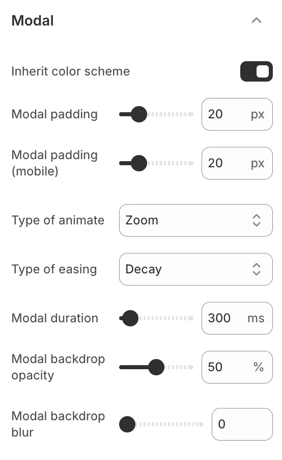
Configure modal border, shadow, animation, and overlay appearance.
13. Drawer
Use this settings to change the setting of the drawer animation, like cart drawer or menu drawer
14. Swatches
Use this settings to change the setting of the product variant swatches, like the size, or using variant images or not.
15. Variant pickers
Use this settings to change the look of the variant pickers, like their width.
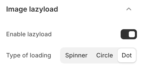
16. Image lazyload
Enable/Disable and choose between 3 types of lazy loading strategies for images.
17. Currency format
Enable this settings to show the currency code on the store.
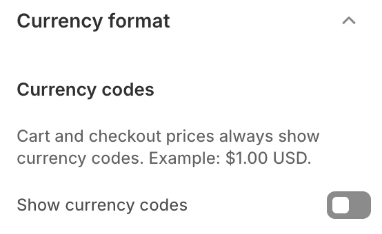
- Show currency code: Enable so cart and checkout prices always show currency codes. Example: $1.00 USD.
18. Dark mode
Enable dark mode support for your store.
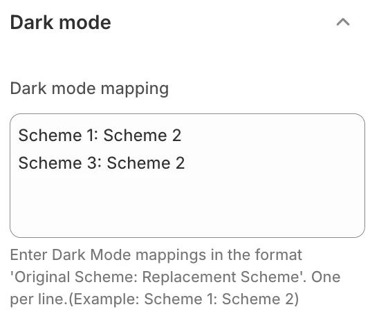
When enabled, the theme will respect the visitor's system preference for dark mode, automatically switching to a dark color scheme.
19. Social media
This section describes the Theme settings > Social Media menu options to integrate social media into your store.
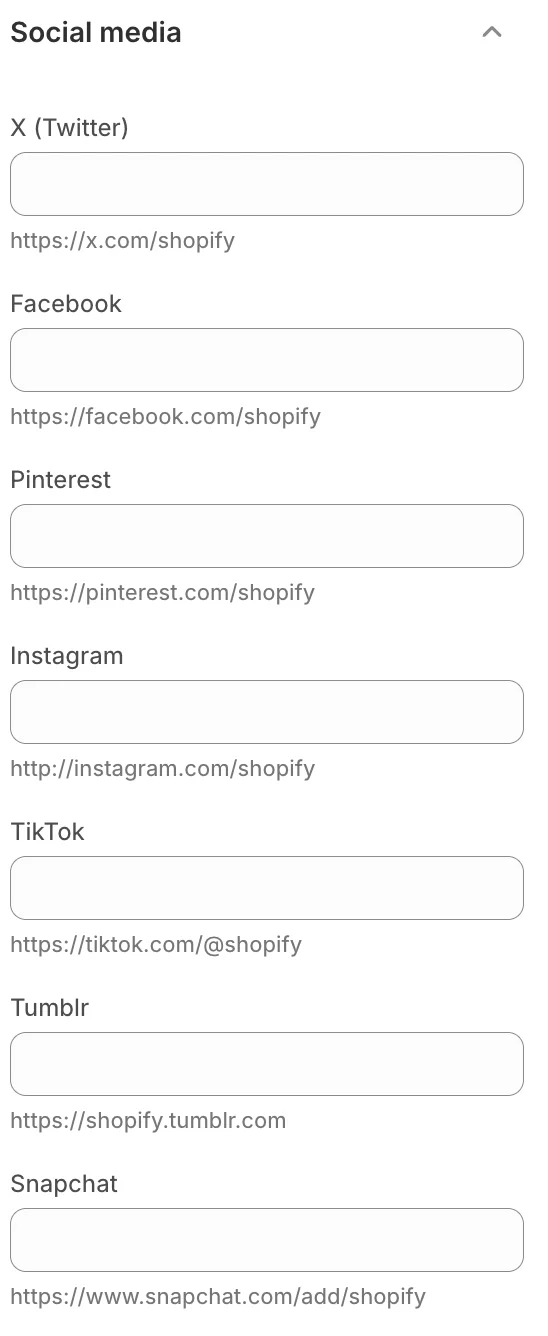
- Social media accounts: Add the link to your store's social media. Enter links for Instagram, Facebook, Twitter, Pinterest, Snapchat, TikTok, Tumblr, Youtube, and Vimeo.
When you enable social media links, the theme displays corresponding social media links as text/ icons throughout your store.
20. Custom CSS
Use this to add custom CSS to the theme.
21. Theme style
Use it to change the theme style (all of theme settings values) according to the presets available in the theme.
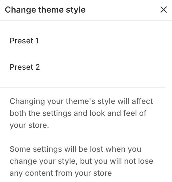
The settings for each preset style are stored in the settings_data.json file.