Product card blocks
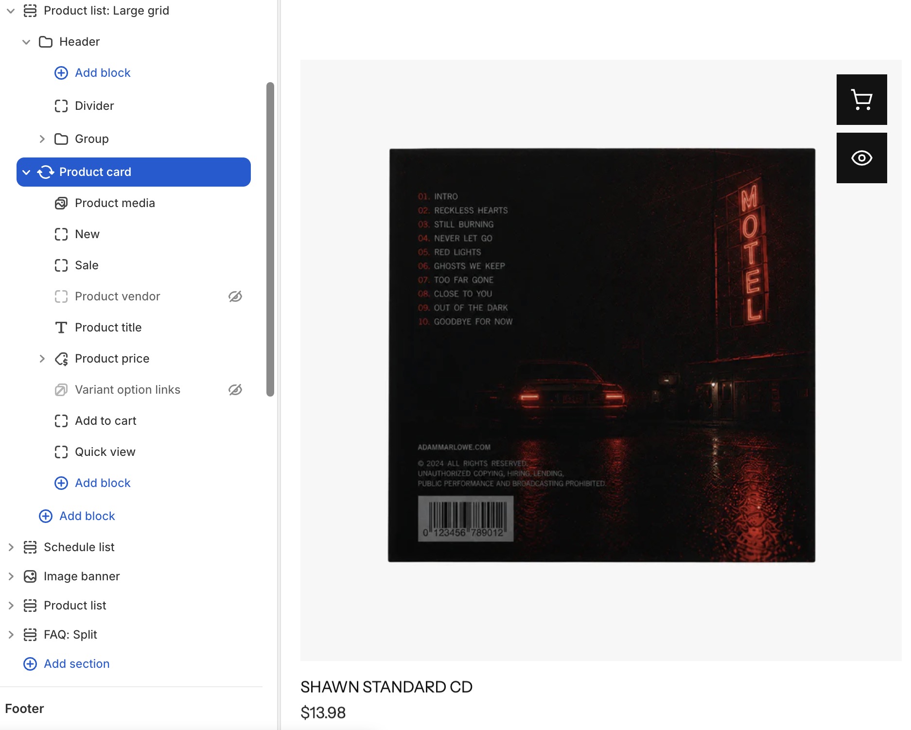
Product card blocks are specialized content blocks designed specifically for product sections, collection pages. These blocks provide a comprehensive interface for displaying product information, along with built-in features like Add to Cart and Quick View to make purchasing more convenient.
Settings
- Product: Select a specific product (or use dynamic product from the section context).
- Product card type: Choose from multiple card layout styles.
- Color scheme: Apply a color scheme to the card.
- Background: Color, gradient, or transparent.
- Border radius: Corner roundness.
- Animation: Entrance animation effect.
Product card's blocks inside
| Block name | Description |
|---|---|
| Product media | Show product medias: image, video, 3d model. |
| Sale | Show sale badge. |
| Product vendor | Show product vendor. |
| Product title | Show product title. |
| Product price | Show product price. |
| Variant option links | Show variant options. |
| Add to cart | Show add to cart button. |
| Quickview | Show quickview button. |
Product media settings
- Link to product page: Link to product page.
- Aspect ratio: Control the media display ratio.
- Type: Product media transition effect:
auto,carousel,only video.
Product title settings
- Tag: HTML heading tag (H1-H6).
- Typography: Font, size, weight, color controls.
- Link: Optionally link to the product page.
Product description settings
- Line clamp: Limit visible text lines.
- Typography: Font, size, weight, color controls.
Product vendor settings
- Typography: Font, size, weight, color controls.
Product price settings
- Typography: Custom font, size, weight, line height, letter spacing for the price.
- Price color: Color for the current price.
- Compare-at price color: Color for the original/compare-at price (strikethrough).
- Show tax info: Display tax inclusion/exclusion information.
- Alignment: Left, center, or right alignment.
Variant option links settings
- Style: Dropdown, buttons, or pill-style selectors.
- Option name: Display the name of the currently selected option.
- Typography: Custom font, size, weight controls.
- Direction & alignment: Horizontal or vertical layout.
Add to cart settings
- Button type: Primary or secondary.
- Button variant: Filled, outline, or ghost.
- Tooltip: Enable/disable tooltip on hover.
- Size: Small, medium, or large.
- Width: Fit content or fill available space.
- Icon: Optional cart icon.
Quickview settings
- Button type: Primary or secondary.
- Button variant: Filled, outline, or ghost.
- Tooltip: Enable/disable tooltip on hover.
- Size: Small, medium, or large.
- Width: Fit content or fill available space.
- Icon: Optional quickview icon.
Sale settings
- Content type:
text,percentage,fixed amount.
tip
Something to keep in mind when using the Product card section:
- Remember to optimize product medias for a better loading speed
- You can hide certain block product information that you don’t want to display.
- It’s recommended to set up complete variant and sale information (if available) to ensure the product card is displayed fully.