Collection card blocks
Collection blocks display your store's collections — collection cards, images, titles, and product counts. Use them to help customers browse and discover your product categories.
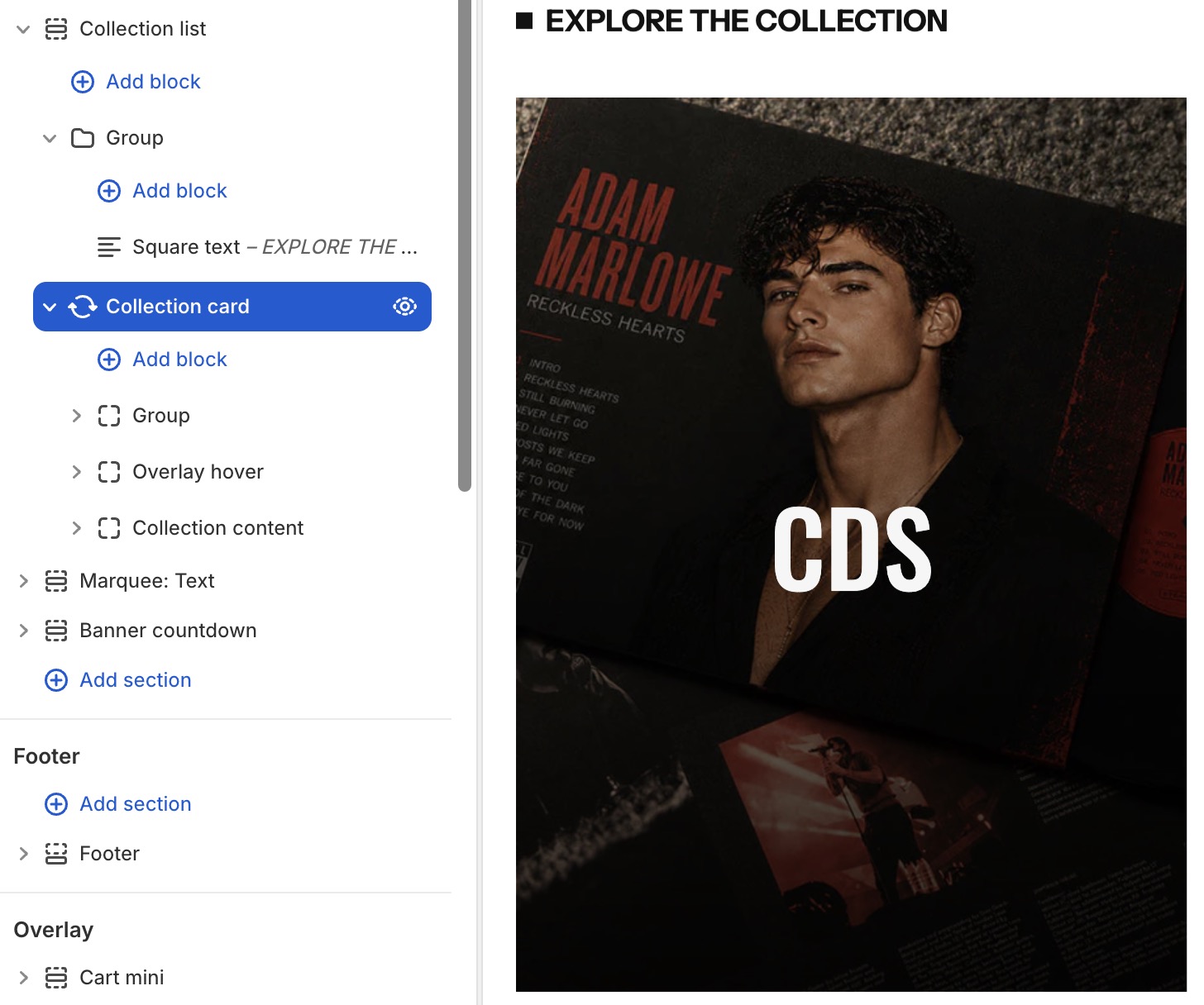
Settings
- Collection: Select a specific collection or use dynamic context.
- Direction: Column (vertical) or row (horizontal) layout.
- Alignment: Content alignment within the card.
- Gap: Space between child elements.
- Wrap: Enable content wrapping.
- Size: Width and height controls.
- Background: Color, gradient, or image background.
- Border radius & border style: Card edge styling.
- Hover effects: Change background, border, or shadow on hover.
- Animation: Entrance animation effect.
Collection card's blocks inside
| Block name | Description |
|---|---|
| Collection media | Show collection image |
| Collection title | Show collection title. |
| Collection description | Show collection description. |
Collection media settings
- Aspect ratio: Auto, square, portrait, landscape, or custom.
- Border radius: Corner roundness.
- Overlay: Optional color overlay on the image.
- Animation: Image entrance effect (e.g., zoom-out).
Collection title settings
- Tag: HTML heading tag (H2-H6).
- Typography: Font, size, weight, color, letter spacing.
- Link: Automatically links to the collection page.
Collection description settings
- Typography: Font, size, color controls.
- Line clamp: Limit visible text lines.